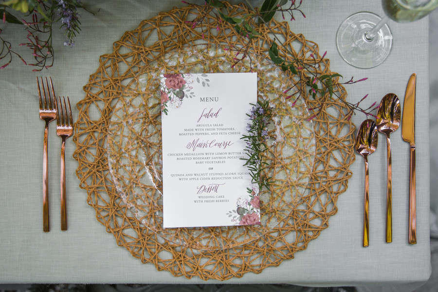
Beyond telling everyone what’s coming, the menu dresses up the place setting, gives anyone with dietary questions a heads-up, and doubles as a keepsake the second you add your names. The format you pick says as much about your wedding as the food does. White calligraphy reads classic. A black card with gold reads dramatic. Clear acrylic reads modern before a single word is read.
So we pulled our favorite menu cards from real Love & Lavender weddings and styled shoots, then sorted them by style so you can skip straight to yours. Fall for one and you can click through to see the full day. Scroll on for shoppable options too, and for more, browse our Real Weddings directory.
Classic and Elegant Wedding Menu Cards
If your wedding lives in the white-flowers-and-good-lighting school of pretty, start here. These are the menu cards that work at almost any venue: clean type, a little calligraphy, the occasional wax seal or gold edge to keep them from reading plain.
Napkin-Tucked Three-Course Card
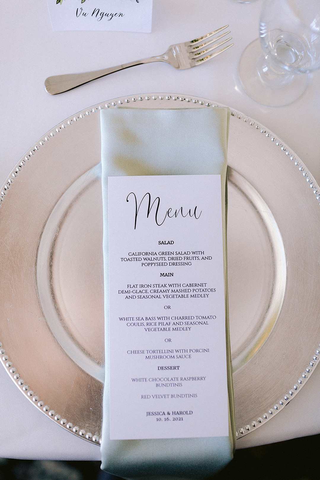
The classic move: a slim card, slipped into the napkin fold, three courses clearly labeled. Salad, main, dessert. Nobody’s confused, and the place setting gets a little vertical interest for free. Country club catering, handled.
See Jessica and Harold’s San Jose Country Club Wedding →
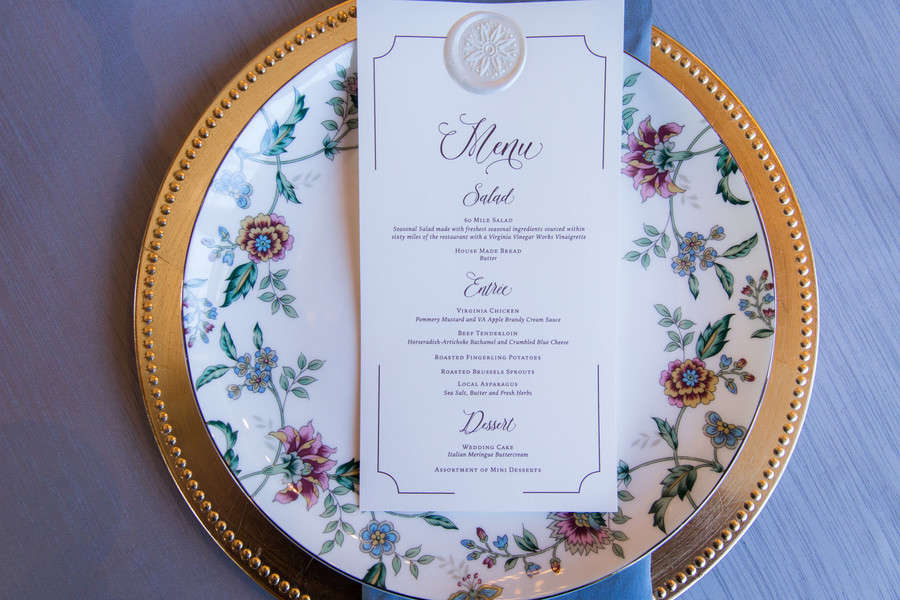
White Cards on Gold Chargers
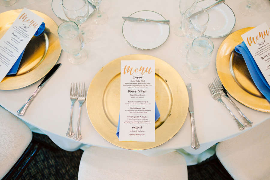
This is what happens when the chargers do the heavy lifting. The cards are plain white, but the gold plates underneath make the whole setting glow. Blue napkins keep it from tipping into too-much. Smart contrast, very little effort.
See Victoria and Adam’s Virginia Resort Wedding →
Hand-Lettered Card with a Choice of Entree
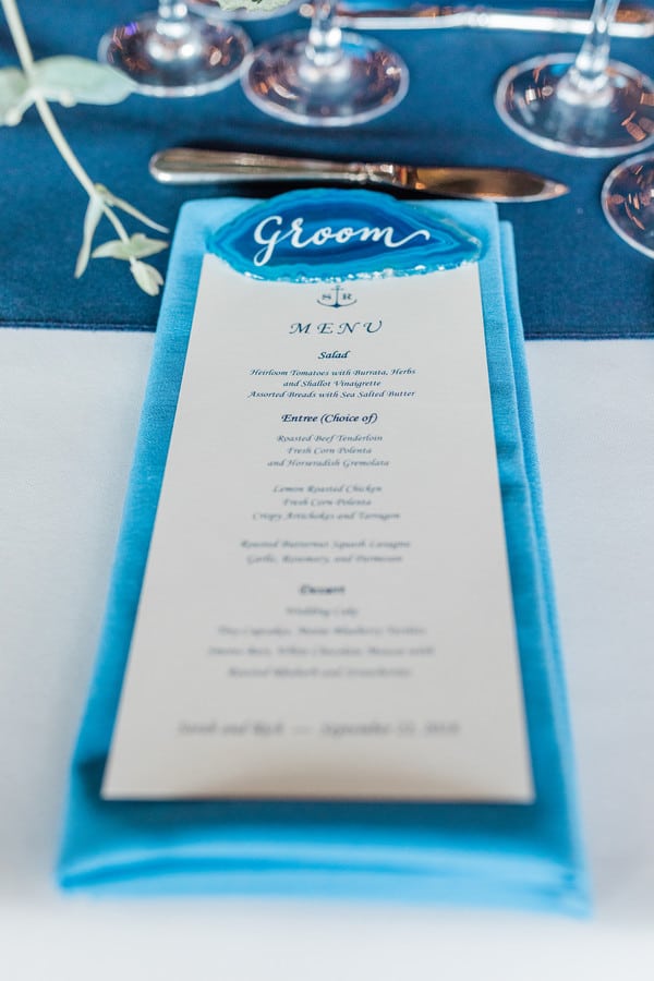
Notice the “(choice of)” next to the entree, which is the polite way of telling guests they get to feel fancy picking between two things you already approved. Hand-lettered, propped on a blue napkin, coastal without a single anchor in sight.
See Sarah and Rich’s Maine Island Wedding →
White Menu Sealed with Wax
A wax seal is the detail that makes people pick the card up. Everything else stays clean and white, courses stacked simply, and then there’s that little pressed blob of drama anchoring the top. An old-world touch on a fall barn table.
See Wellsley and Austin’s Mount Ida Farm Wedding →
Simple White Calligraphy Menu
“The menu,” in soft script, like it’s the title of a very short and very delicious book. The rest is black type on white, no ornament, letting the calligraphy be the one flourish. This is the version that works at basically any wedding.
See Katelyn and Jonathan’s Vesuvius Vineyard Wedding →
Monogrammed Menu on a Folded Napkin

A stacked monogram up top, the courses underneath, and not much else. That’s the whole trick. Tucked onto a folded napkin at each place setting, it reads as personal without trying too hard. Short ribs and a named salad have never looked so polite.
See Katrina and Eric’s Ashland Berry Farm Wedding →
Tall Gold-Bordered Menu Card

Height is the move here. A taller card with a thin gold border reads as formal the second you see it, and it gives the courses room to breathe instead of cramming them in. First course, second course, the proteins spelled out. Very “we hired a real caterer.”
See this Mauve and Gold Styled Shoot →
Gold Script on White, Purple Napkin
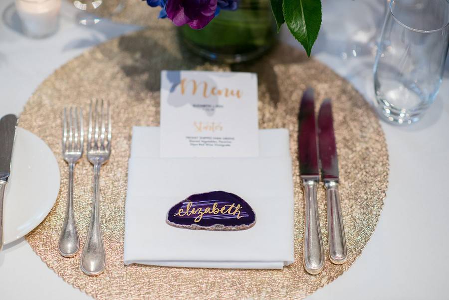
Gold script does a lot of quiet work here. The card itself is plain white and small, but set against a deep purple napkin, it suddenly looks like the most expensive thing on the table. At 11,000 feet, no less.
See Elizabeth and Ken’s Vail Mountain Wedding →
Silver Glitter Menu Header on White

The card stays clean and white until you hit that big silver-glitter MENU, which does all the glam work on its own. Set on a blue ombre napkin and a silver charger, it’s the metallic move done in silver instead of the usual gold.
See this Glitz and Glam Silver Styled Shoot →
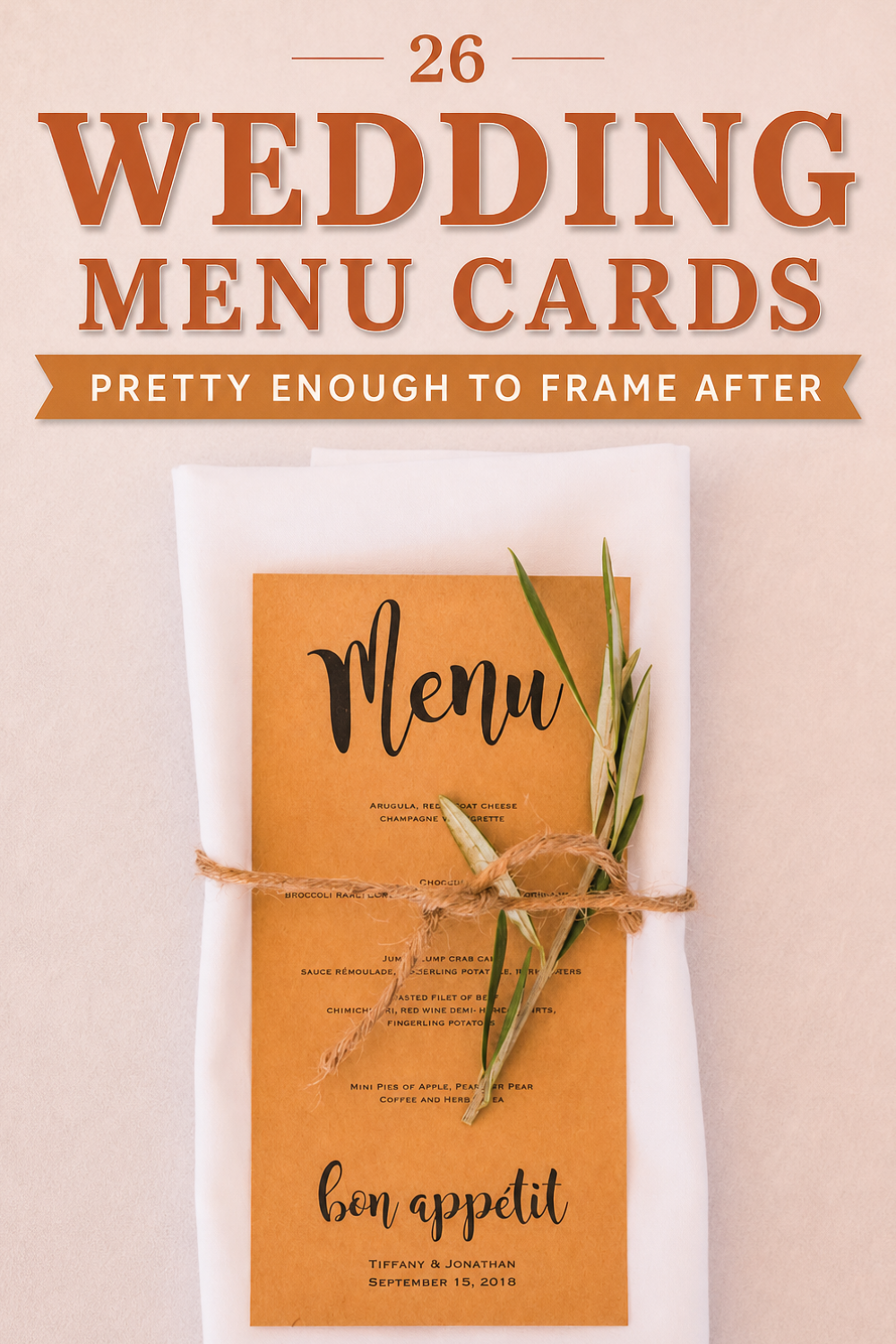
Earthy Brown Calligraphy Menu

Warmer than the usual white, this one leans into a soft brown palette with calligraphy and a little “bon appétit” sign-off at the bottom. The names and date sit right on the card, so it doubles as a keepsake. A beach wedding, but grown-up about it.
See Tiffany and Jonathan’s Long Beach Island Wedding →
Minimal White Card on the Plate

Proof you don’t need a full page to make the point. This one’s barely bigger than a place card, just “Mains” and the dish, parked right on the plate. For a backyard wedding, that kind of restraint is exactly right.
See Katie and Jonathan’s Backyard Fall Wedding →
Moody and Dramatic Wedding Menu Cards
Dark cards are having a moment, and the menu is the easiest place to test one. Black, slate, deep purple, a heavy border: these lean into contrast instead of away from it, and they photograph like a million bucks under candlelight.
Black Card with Gold Lettering

Flip the whole thing dark and let gold do the talking. A black card, gold courses, and suddenly a holiday dinner menu looks like an invitation to somewhere exclusive. It pairs with red and candlelight like it was born for it. Winter weddings, take notes.
See this Romantic Christmas Dinner Styled Shoot →
Black-and-White Typewriter Menu

Typewriter type, strict black on white, one dish per line. No script, no flourish, just a confident little column of food that happens to include a “chocolate dome.” This is the menu for couples who think calligraphy is trying too hard. Very Amsterdam.
See Sylvia and Alexander’s Amsterdam Wedding →
Slate-Look Menu with Chalk Lettering

A beverage course gets its own line here, which I respect. The slate-and-chalk look brings drama without going fully black, and the pale lettering pops against the dark ground. Earthy, a little rustic, still unmistakably elegant.
See this Olive and Lemon Slate Styled Shoot →
Dark-Bordered Dinner Menu

A heavy dark border turns a simple dinner menu into something with edges. Names up top, “Dinner Menu” underneath, then the proteins. The frame does what a frame always does: it makes you take the thing inside more seriously.
See Angela and Kimhout’s Cambodian-American Wedding →
Menu for a Dark, Moody Table

“Treats” instead of “dessert” is the wink, and it suits a table this theatrical. Deep reds, dark wood, marble, the whole vampire-dinner-party energy. The menu plays along instead of fighting it. Proof a moody palette doesn’t have to read spooky.
See this Wicked Autumn Vineyard Styled Shoot →
Long Deep-Purple Held Menu
A long, deep-purple card, color saturated all the way to the edges. Against a boho palette of fuchsia and pink, the dark purple grounds everything. It’s the rare menu that works as a photo prop and an actual menu at the same time.
See this Boho Chic Colorado Styled Shoot →
Floral and Colorful Wedding Menu Cards
When the rest of your palette is already doing something, the menu can join in. Watercolor blooms, a single bold napkin, one pop of script in an unexpected color. These prove you don’t need a whole rainbow to add personality, just one well-placed hit of it.
Pink Floral Menu with Numbered Courses

Numbered courses give this one a tasting-menu feel, even though it’s an elopement for two. Soft pink florals frame the edges, the filet mignon makes an appearance, and the whole thing reads like a love letter that happens to list food. Rose motifs, delivered.
See this Ann Arbor Riverside Elopement →
Watercolor Floral Menu with Gold Foil
Watercolor blooms plus gold-foil calligraphy is the combination that shows up on every vintage-romantic mood board, and for good reason. Soft, painterly, a little shimmer where the light hits. There are four courses, but you’ll remember the flowers.
See this Romantic Vintage Styled Shoot →
Floral Menu with Rose Gold Cutlery
The card stays simple so the styling around it can sing: florals creeping in at the corners, rose gold cutlery laid alongside. In a redwood forest with a dusty-rose palette, that warm metallic is exactly the right finish. Pretty without being precious.
See this Redwood Forest Styled Shoot →
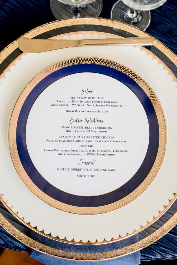
Blue Menu Card, Four Courses
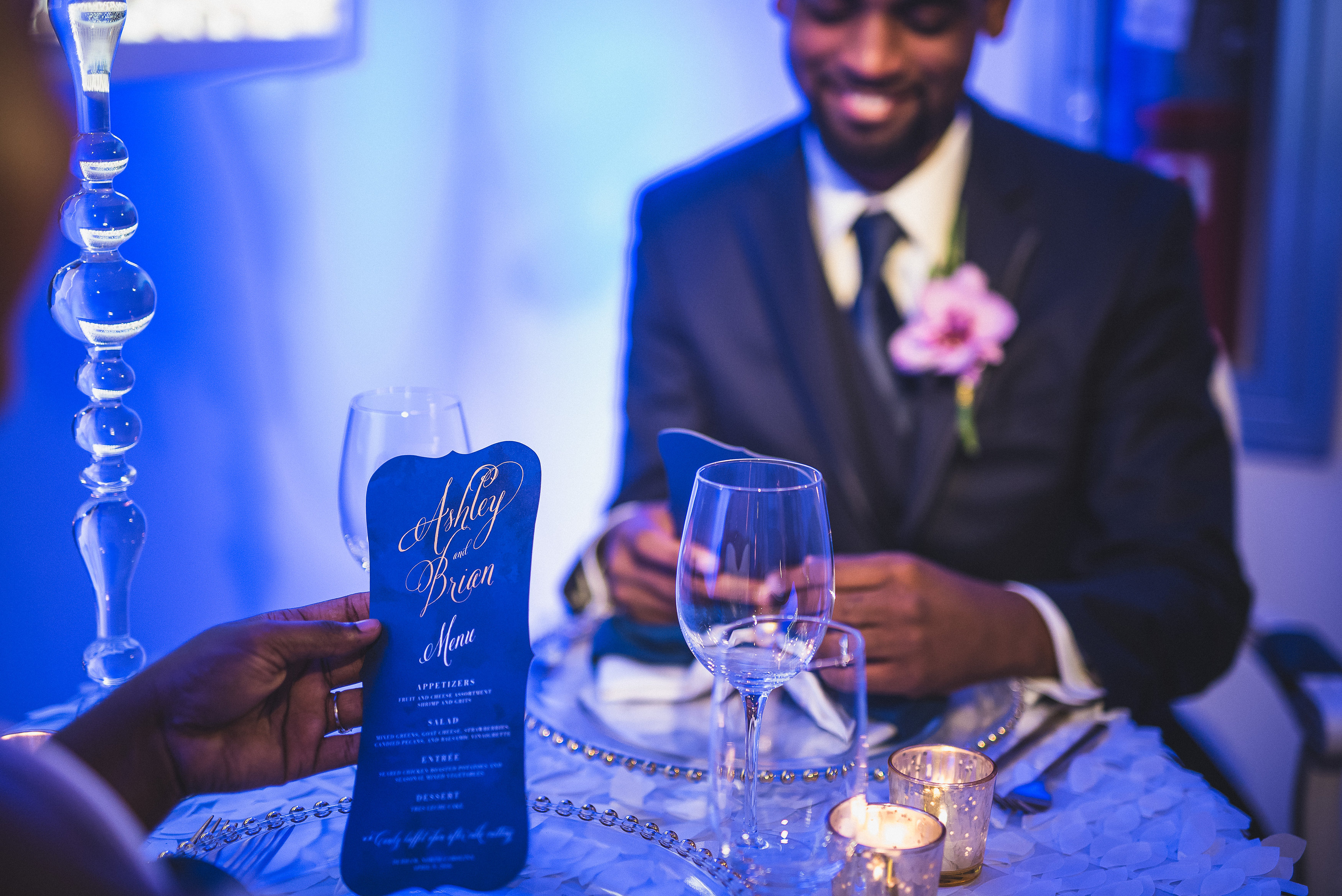
A confident wash of blue across the whole card, names at the top, four courses below. Against metallics and winter white it reads cool and modern, the opposite of a fussy floral. Sometimes one strong color is the entire design.
See this Metallic Navy Winter Styled Shoot →
Banner-Topped Menu on a Red Napkin
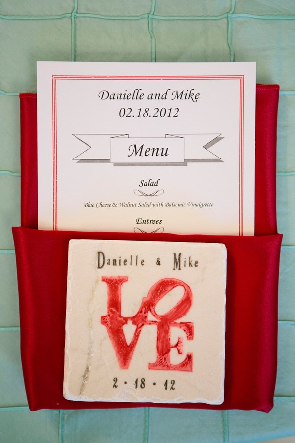
The card’s actually white, but drop it into a bright red napkin against a turquoise scheme and the color does all the work. There’s a little “Menu” banner up top, names and date for the keepsake factor. Bold palette, classic bones.
See Danielle and Mike’s Garden Club Wedding →
White Menu with Orange Script

One pop of orange script is all it takes to warm up a plain white card. The menu itself leans fresh and veg-forward, charred beets and chickpea fritters, which feels right for a wedding inside a glass conservatory full of plants. Color used with restraint.
See Jack and Nori’s Conservatory of Flowers Wedding →
Modern and Unexpected Wedding Menu Cards
These are for couples who hear “menu card” and immediately want to do the opposite. Clear acrylic, round shapes, casual wording, a hexagon if the theme calls for it. The format itself becomes the design.
Clear Acrylic “Good Eats” Menu

Printed straight onto clear acrylic, so the table shows through behind the type. “Good eats” and numbered courses keep it playful, the material keeps it modern. It’s the kind of detail that photographs like a tiny piece of art. Beach-boho, but elevated.
See this Windansea Beach Styled Shoot →
Round Menu Centered on the Plate
Ditch the rectangle. A round menu sitting dead-center on the plate makes the place setting look composed on purpose. It catches the eye precisely because it breaks the shape you expect. Small swap, big difference.
See Denise and Bob’s Maine Wedding →
Casual “Let’s Eat” Menu

“Let’s eat” instead of “Menu” instantly drops the formality, which is the whole point. The courses are all still there, the tone just got friendlier. On a striped napkin against an emerald-and-black scheme, it’s proof modern can still be warm.
See this Ethereal Emerald Styled Shoot →
Superman Gold-Glitter Menu
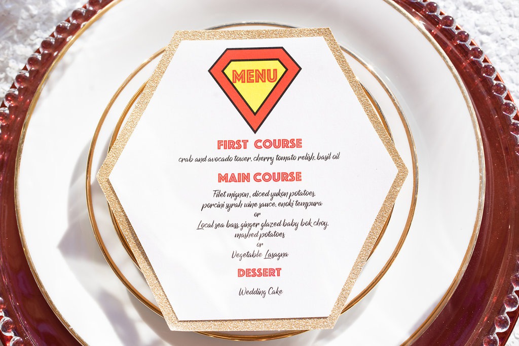
A six-sided card coated in gold glitter, because a superhero wedding is no place for a plain rectangle. The shape alone makes guests pick it up, and the glitter ties it to the rest of the bold styling. Themed weddings live and die on details like this.
See this Superhero-Themed Styled Shoot →
Rustic and Natural Wedding Menu Cards
Barns, beaches, backyards, and forests don’t ask for fussy stationery. These menus lean into natural materials and laid-back presentation: painted wood, kraft tones, cards styled right on the grass. Comfortable, but still thought-through.
Hand-Painted Wooden Menu Sign
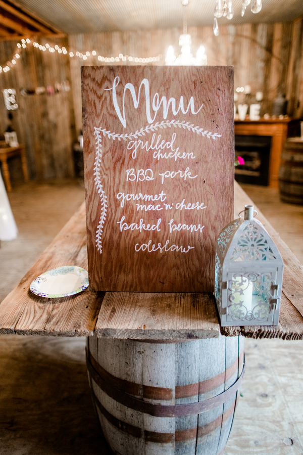
Skip the individual cards entirely and paint the whole menu onto a slab of wood. One big rustic sign, white script, the comfort-food lineup right there for everyone to read on the way in. For a barn wedding, this is the format that just makes sense.
See Abigail and Austin’s Georgia Barn Wedding →
Chalkboard Menu Propped in a Wood Stump
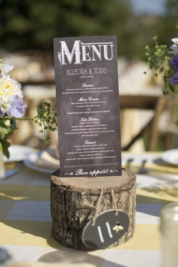
A dark chalkboard menu, white lettering all the way down to the “Bon appétit,” slotted straight into a cut log that doubles as the table number stand. Wildflowers and a yellow gingham cloth keep the whole thing firmly in garden-picnic territory.
See Allegra and Todd’s Natural Rustic Wedding →
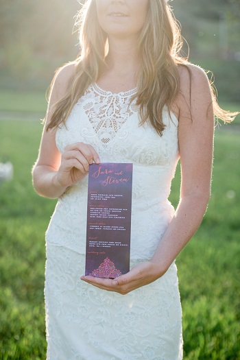
Buffet Menu Cards

A buffet doesn’t get a pass on a good menu. These spell out the spread, tortilla soup, homemade guac, the works, so guests know what they’re loading up on. Styled right on the grass for the photo, very backyard-Texas about the whole thing.
See Amanda and Steven’s San Antonio Backyard Wedding →
Menu Wrapped Around a Wood Block

Instead of leaning the card against something, wrap it around a little wood block so it stands up on its own. The raw wood plays nicely with an industrial setting, the kraft-toned card keeps it natural. Function and styling in one small, smart move.
See this Industrial Yellow Styled Shoot →
Blue-and-White Menu on a Dark Plate
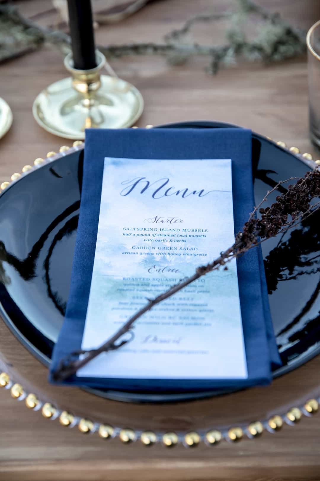
A soft blue-and-white card, set against a dark napkin and black plate so it really stands out. The contrast is the point: light, airy stationery on a moody, earthy setting. Very Pacific Northwest, where rustic and refined tend to share a table.
See this Pacific Northwest Styled Shoot →
Wedding Menu Card FAQs
Do you really need wedding menu cards?
No rule says you must, but they earn their keep. Guests with dietary needs know what’s coming, the place setting looks finished, and the table reads more intentional in photos. For a buffet, a menu card or sign is genuinely useful as signage. For a plated dinner, it’s mostly about polish, and polish is worth a lot in pictures.
One menu card per guest, or one per table?
Either works. Per-guest cards, tucked in the napkin or set on the plate, feel more formal and give every place setting something to look at. One larger card or sign per table saves money and paper. Buffets do great with a single big sign at the start of the line.
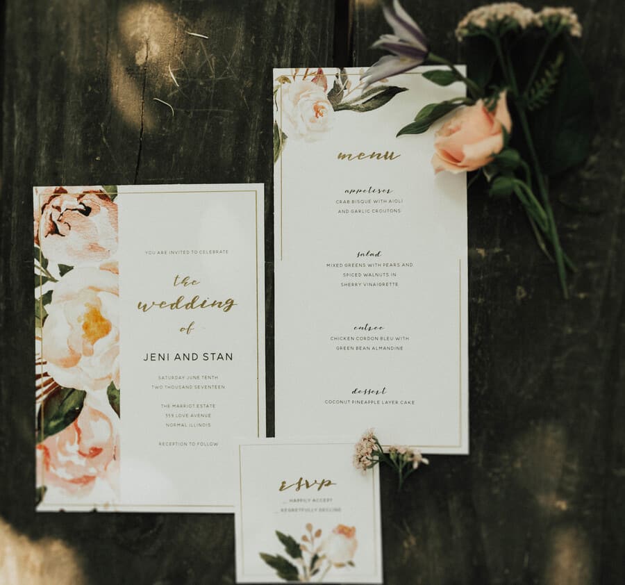
What should actually go on a wedding menu card?
At a minimum, the courses. Most couples add a “Menu” header and list the dishes by course, and many include their names and the date so the card doubles as a keepsake. If you’re offering a choice of entree, write “choice of” so guests aren’t left guessing whether they get both.
How do you save money on menu cards?
Print fewer of them. One per place setting adds up fast across 150 guests, so consider one per couple, one per table, or a single painted sign for the whole room. Choosing a clean printed font over custom calligraphy also drops the cost without looking cheap.
Should the menu card match the rest of the stationery?
Ideally yes, at least in font and color. The menu, place cards, and invitations don’t have to be identical, but they should look related. Pulling one color or one typeface through all of them is usually enough to make the whole table feel cohesive.
Should I send my menu cards out with the RSVP cards?
That depends on whether you’re offering a pre-selected plated menu with multiple courses, or a buffet-style menu where there’s probably something for everyone. Planning as far ahead as possible is undoubtedly helpful to your caterers, so that’s another thing to consider.
Should I use individual menu cards if we’re serving a buffet or family-style meal?
Sure! The primary benefit of using menu cards regardless of what kind of meal you’re serving is that it’ll keep everyone informed about what they’re going to eat and what’s in each dish. If your guest has a food allergy or dietary restrictions, this is really helpful.
Other than that, it’s nice for your guests to be able to peruse the menu items when they find their seats and settle in, so they have an idea of what’s available, especially for dessert (that’s always my priority, anyway). If your menus double as place cards, even better.
What kind of information should I include on my menu cards?
If you’re offering a sit-down, plated meal, include a list of the details of each course and in what order they’ll be served. For a buffet or family-style menu, list the options available and ingredient information on each dish that you’re offering.
Eat, Drink, and Be Merry!
Everything about a wedding celebration is fun (some parts more than others). The food is one of the best parts! Everyone wants to feed their guests well, whether it’s a light reception or a multi-course sit-down meal.
Ask a pro, they’ll tell you the food is one area you can not scrimp on when it comes to your wedding. It only makes sense then to provide your guests with a menu showcasing what they have to look forward to!
Here’s our special recipe for a great wedding: a truckload of good food + an unlimited supply of good wine (more on that in another post) + dancing till you drop = a fabulous time for all. Bon appetit!
Don’t forget to pin this to your Wedding Stationery Board for later!